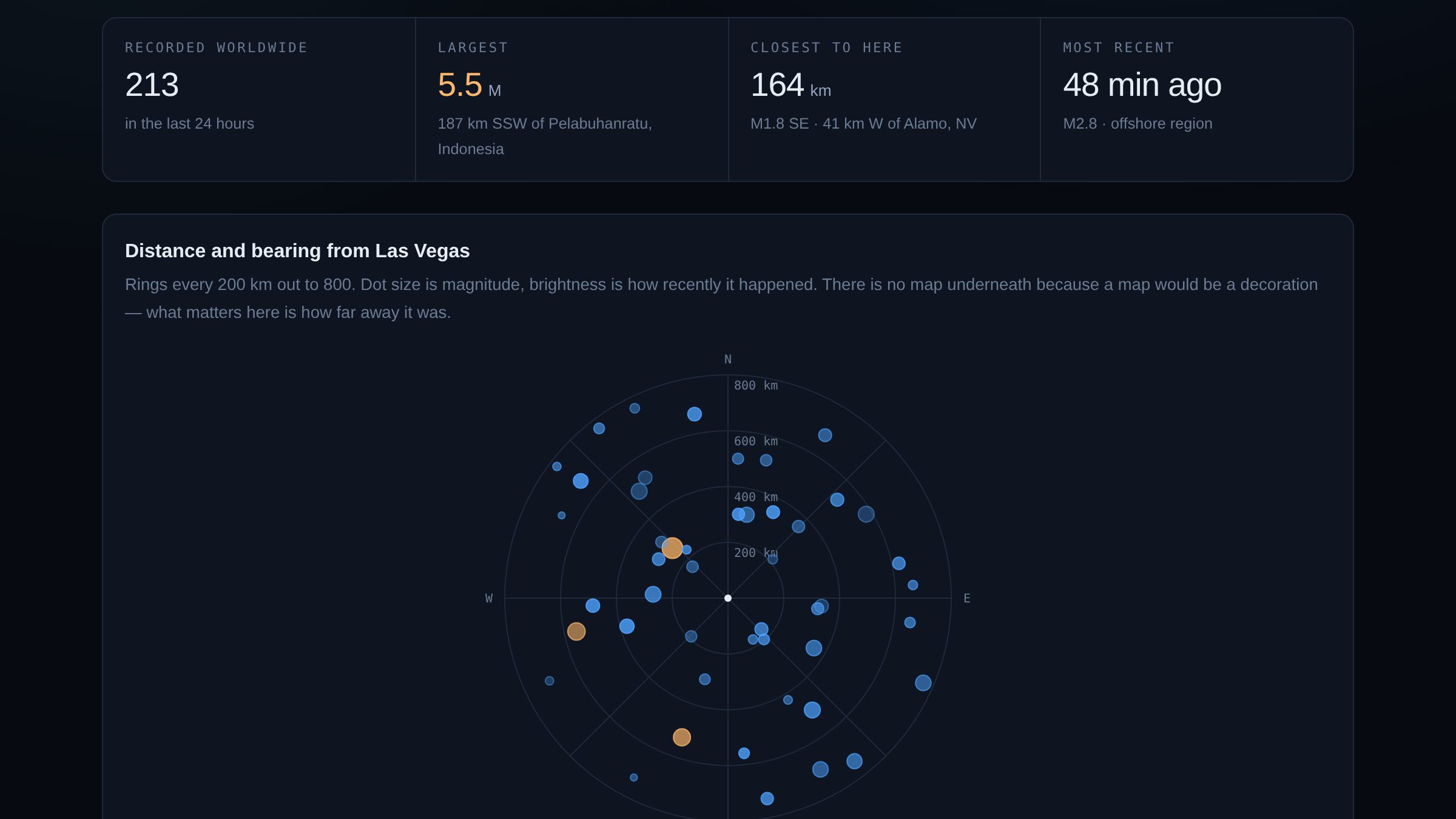
Leaving the map out
The default way to draw earthquakes is dots on a world map, and I built that first. It looks fine and it answers nothing. At world scale every event near you is in the same three pixels, and the thing you want to know — is that close? — is the one thing the projection destroys.
So the main panel is a polar plot centred on Las Vegas: distance as radius, compass bearing as angle, rings every 200 km out to 800. It is a radar screen, which is a borrowed idea, but it is borrowed from an instrument built to answer exactly this question. A basemap under it would be decoration. There isn't one.
A map is a good default and a bad habit. Before drawing one, it's worth asking whether geography is the question or just the data's native format.
Distance and bearing
Both come from spherical trigonometry rather than treating latitude and longitude as x and y, which falls apart quickly at these latitudes — a degree of longitude in Las Vegas is about 20% shorter than a degree of latitude.
- Distance is the haversine formula, accurate to a fraction of a percent on a sphere. The epicentre itself is less precise than that, so there is nothing to gain from a better earth model here.
- The angle is the initial bearing, which is not the heading you would hold the whole way. On a great circle the bearing drifts. What the plot claims is the direction you would set off in, which is what a compass rose is for.
Reading the noise floor
The magnitude panel shows everything the network recorded, and the bottom of it is not geology. Below about M1.5 an event only appears where seismometers happen to be dense, so the chart is partly a map of instrumentation.
That is a real limit on the data and the page says so rather than presenting the floor as if it were the natural rate of small earthquakes. Southern California is over-represented on this chart for the same reason it is over-represented in every earthquake dataset: somebody put a lot of sensors there.
Saying no
The page ends by answering whether any of this is worth worrying about. Nearly every day the answer is no, and it says no — with the count, the largest magnitude and the closest distance behind it.
It would have been easy to make a quiet day feel eventful. Colour the dots red, use the word "activity", let the visitor infer. The honest version says that nothing within 800 km reached the threshold where a person notices without an instrument, and that the Basin and Range does this continuously.
What I'd do next
- Depth, which the plot currently throws away. A shallow M3 nearby matters more than a deep M4, and there's no encoding for it yet.
- The USGS "felt report" count, which is the only genuinely human number in the feed: how many people filled in a form saying they noticed.
- A longer window than a day, so the background rate is visible as a rate rather than as a single day's sample.