What it shows
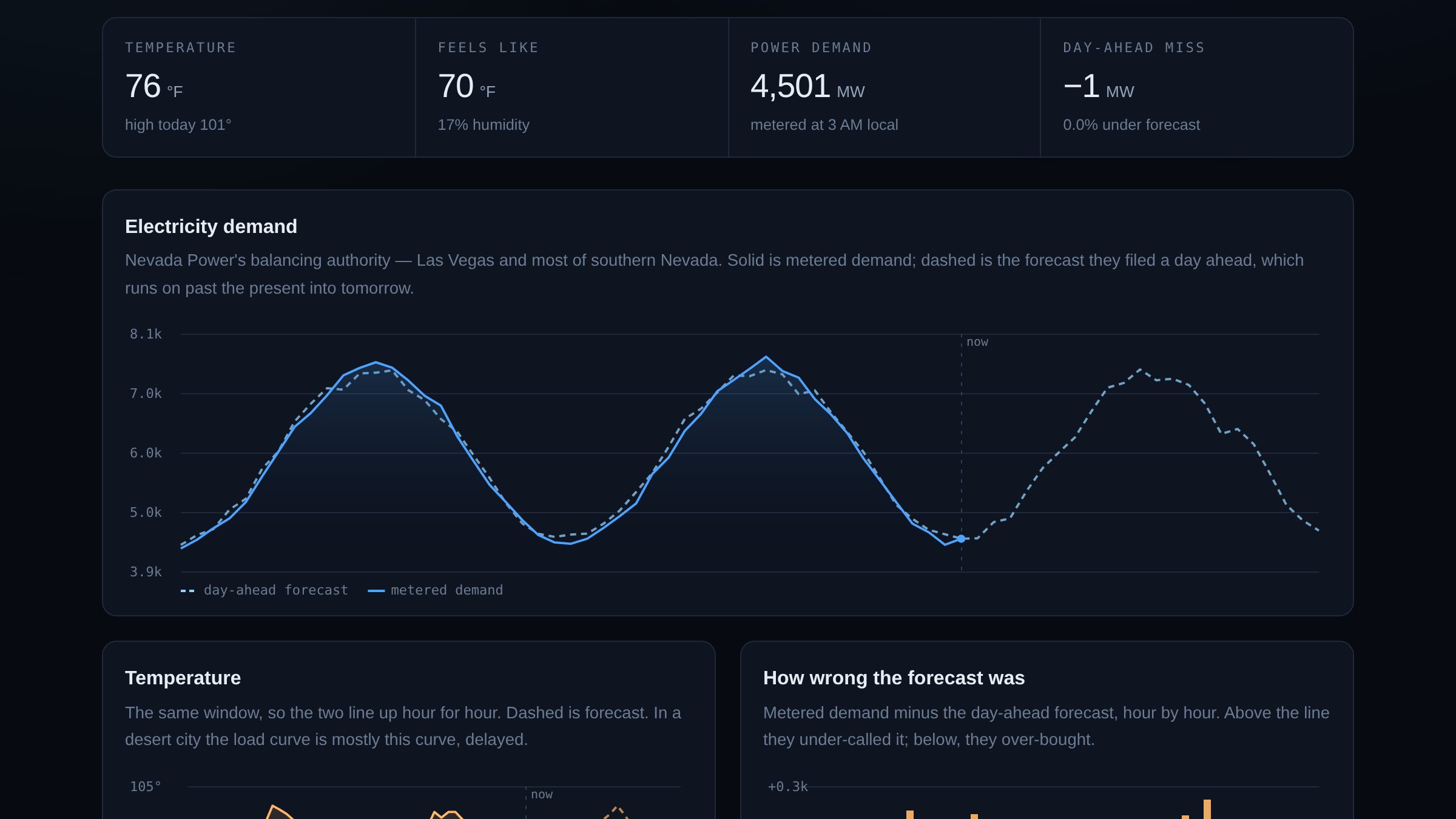
Three things on one clock. Metered electricity demand for Nevada Power's balancing authority — Las Vegas and most of southern Nevada — which lands within the hour. The day-ahead forecast the same authority filed yesterday, which runs about twenty-two hours past the present. And the temperature over the same window, past and forecast.
The interesting part isn't any of those curves. It's the distance between the second and the first: a utility committing, a day in advance, to a number it will be judged on.
The keyless endpoint
EIA's documented v2 API wants a registered key, which for a static site means either publishing the key in the page source or standing up a proxy to hide it. Neither is appealing: the first is a key you've given away, the second is a server you now have to keep alive.
The Hourly Electric Grid Monitor — EIA's own public dashboard — is fed by a different endpoint that needs no key and sends permissive CORS headers. It answers in about 5 kB. So the page uses that, and there is nothing between the visitor and EIA.
Worth checking before you build the proxy: the endpoint behind a public dashboard is often reachable and often keyless, because the dashboard is a browser too.
Why one utility and not the country
The first version asked for the US Lower 48 totals, which look more impressive and are quietly broken. National figures are sums over sixty-odd balancing authorities, and the final hours of the national day-ahead forecast are summed over only the ones that have filed so far. The series doesn't stop; it collapses, from about 205,000 MW to 45,000 to 14,000 across three hours.
Drawn without thinking, that is a cliff at the right-hand edge of the chart that looks like a grid failure and is actually a paperwork deadline. A single authority has no such seam, and Nevada Power happens to be the one that keeps the lights on where I live.
Cross-correlation, not peak-hunting
The question the page ends on is how far demand trails temperature. The obvious way to answer it is to find the hottest hour, find the highest-demand hour, and subtract.
That works for exactly one day. Widen the window to forty-eight hours and both of those maxima repeat, so the two you find can land on different days and the answer comes back as "the peak arrived twenty-four hours after the heat" — arithmetic, delivered with a straight face. My first version did this, and the fixture data caught it.
So it shifts the temperature series forward an hour at a time, scores each shift against demand with a Pearson correlation, and keeps the best one. It reports the coefficient alongside the lag, because a lag with a weak correlation behind it is not a finding, and on a mild day that is exactly what you get.
One clock for three charts
Metered demand stops at the present hour. The forecast runs into tomorrow. Temperature covers both. Plotting each by array position would stretch every series to fill the frame independently, so a spike in demand would sit above the wrong hour of weather.
All three charts take an explicit time domain instead, computed once and passed in. That is the only reason the vertical "now" marker means anything: it is the same instant on every panel.
What I'd do next
- Fuel mix, which would show how much of an evening peak is gas and how much is the solar that has just stopped producing. It needs the keyed API, so it needs a decision about the key first.
- Interchange — southern Nevada imports a lot, and the gap between demand and local generation is the more honest picture of where the power comes from.
- Scoring the forecast over a month rather than two days, which is the timescale on which "how good are they at this" is actually a question.