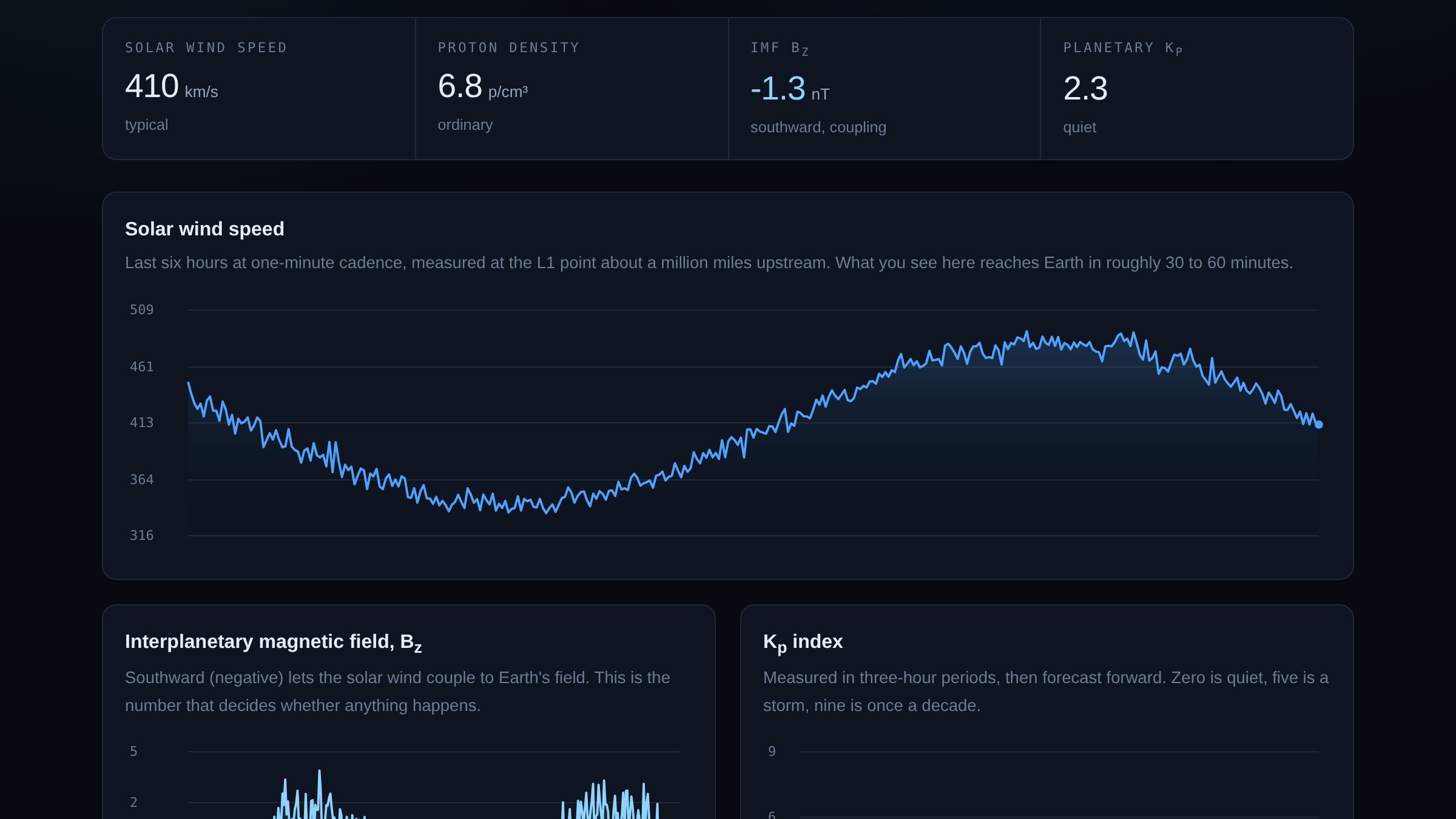
What it shows
Everything on the page comes from the Space Weather Prediction Center. The solar wind readings are taken at the L1 Lagrange point, roughly a million miles upstream of Earth, which is why the charts are a preview: what the spacecraft sees now reaches us in about thirty to sixty minutes.
The number that actually matters is Bz, the north-south component of the interplanetary magnetic field. When it points south it can connect with Earth's field and pour energy in. When it points north, almost nothing happens no matter how fast the wind is blowing. Speed gets the headlines; Bz decides the outcome.
The endpoints everyone links to don't work
The obvious solar wind feeds are the six-hour products at
/products/solar-wind/plasma-6-hour.json and its magnetic-field twin. They are
the ones in every tutorial. They are also the ones the first version of this page shipped
with, and on the live site every reading was a dash.
Those files send no Access-Control-Allow-Origin header, so no browser on
another origin is allowed to read them. Nothing about that is visible from the terminal:
curl fetches them happily, because CORS is a rule browsers enforce on
themselves and curl is not a browser. The only way to find it was to open the
console on the deployed page and read the error.
The real-time files under /json/rtsw/ do send the header. The trade is that
they arrive as 24 hours of one-minute samples, with no shorter version offered: roughly
4.4 MB of JSON between the two files, which gzips down to about 250 KB on the wire. The
page takes the whole day and keeps the last six hours of it. That is a lot of rows to
throw away, and still cheaper than standing up a proxy of my own to trim them, which would
have put a server I have to keep alive between the visitor and NOAA.
It isn't one spacecraft
The bigger surprise was inside the file. Those real-time feeds are not a single instrument's record: ACE, IMAP and DSCOVR all appear in the same array, with overlapping timestamps. In a typical 24-hour file, about a third of the rows are a minute that already appeared, seen by a different spacecraft.
Plot the array as it arrives and you draw three spacecraft on top of each other. It does
not throw, it does not look empty, and it does not look obviously wrong — it looks like a
noisy chart, which is exactly what solar wind data is supposed to look like. NOAA marks
the designated primary feed with active: true, so that flag decides what gets
drawn. If it is missing entirely, which happens during a handover between spacecraft, the
page falls back to whichever single source contributed the most rows rather than quietly
blending them.
The general rule this is a case of: when you can choose between a failure that is loud and a failure that is plausible, take the loud one. Mixed-spacecraft data is the plausible kind, which is why it is worth going out of your way to rule out.
Three shapes, one parser
The feeds don't agree with each other either. The /json/ endpoints return
arrays of objects. The older /products/ endpoints return arrays of arrays
with a header row, like a CSV that took a wrong turn. And the same quantity arrives as
Kp in the measured feed and kp in the forecast one.
So everything goes through one normaliser that flattens both shapes to plain objects and lowercases the keys. Values are then looked up by name, never by column position: if a column moves, a lookup by index doesn't crash, it just starts plotting temperature as speed.
The forecast feed has its own trap. It restates the last several measured periods before
it reaches the predicted ones, all in the same array, distinguished only by an
observed field reading observed, estimated or
predicted. Take the first eight rows and you will draw last week as though it
were next week.
Failing one panel at a time
The four feeds are fetched with Promise.allSettled rather than
Promise.all. With all, one endpoint having a bad afternoon takes
down the whole page. With allSettled, each panel renders if its own data
arrived and reports "no data" if it didn't, and the status pill in the corner counts how
many feeds are missing.
If everything fails, the page says NOAA is unreachable, names the failing feed in the console, and leaves the readings as dashes. It does not fall back to cached numbers or sample data. A dashboard showing stale values with a confident live indicator is worse than one admitting it knows nothing.
Drawing it
The charts are hand-drawn to canvas. That is a deliberate choice rather than stubbornness: importing a charting library would have been faster, and it would also have meant the most visible part of the page was somebody else's work.
- Canvas is sized to its CSS width multiplied by
devicePixelRatio, then the context is scaled back down. Skip that and every line is soft on any modern screen. - The area fill under each line is a vertical gradient from the line colour to fully transparent, so the chart reads as depth rather than as a solid block.
- Gaps in the data break the path instead of drawing a straight line across the hole. Interpolating across missing readings invents data.
- Forecast Kp bars are drawn at lower opacity with an outline; measured bars are solid. The two are never the same thing and should never look the same.
Saying no honestly
The page ends by answering whether the aurora is visible from Las Vegas. The answer is almost always no, and it says so plainly rather than hedging.
It works from a coarse table mapping Kp to the equatorward edge of the auroral oval in geomagnetic latitude, compared against Las Vegas at about 43.5°. That is an estimate and the page labels it as one. It would have been easy to dress this up as a forecast, and several sites do. The difference between a measurement and a model is worth more than the extra confidence.
Try this
Open the page and watch Bz rather than the speed. Most of the time it oscillates gently either side of zero and nothing happens. If it drops below about −10 nT and stays there, check the Kp panel an hour later and watch the bars climb.
What I'd do next
- The auroral oval as an actual drawn shape on a globe, using NOAA's OVATION grid instead of a lookup table.
- GOES X-ray flux, so solar flares appear as they happen rather than as an aftermath.
- A quiet browser notification when Bz goes sharply south, which is the only time any of this is worth being told about.